New Dashboard
The Dashboard is the heart of the Panoptica platform. Its intuitive and interactive graphics present data and insights into the security status across all your cloud resources. Employing a user-friendly interface for effortless workflow initiation, the dashboard enhances your teams operational efficiency, reducing mean time to remediate and promoting proactive risk management.
The new Dashboard experience is more informative, more interactive, and more useful. If you prefer the original dashboard, turn off the New experience toggle in the top right corner of the screen to view the Legacy Dashboard.
Use the Top Bar Filter to filter the results across the platform by Scope and Account using the drop-down lists at the top. You can also select the time frame, from Last 24 Hours to Last Month.

Security Status
The widgets at the top of the Panoptica Dashboard provide a high-level executive summary of your entire tenant.
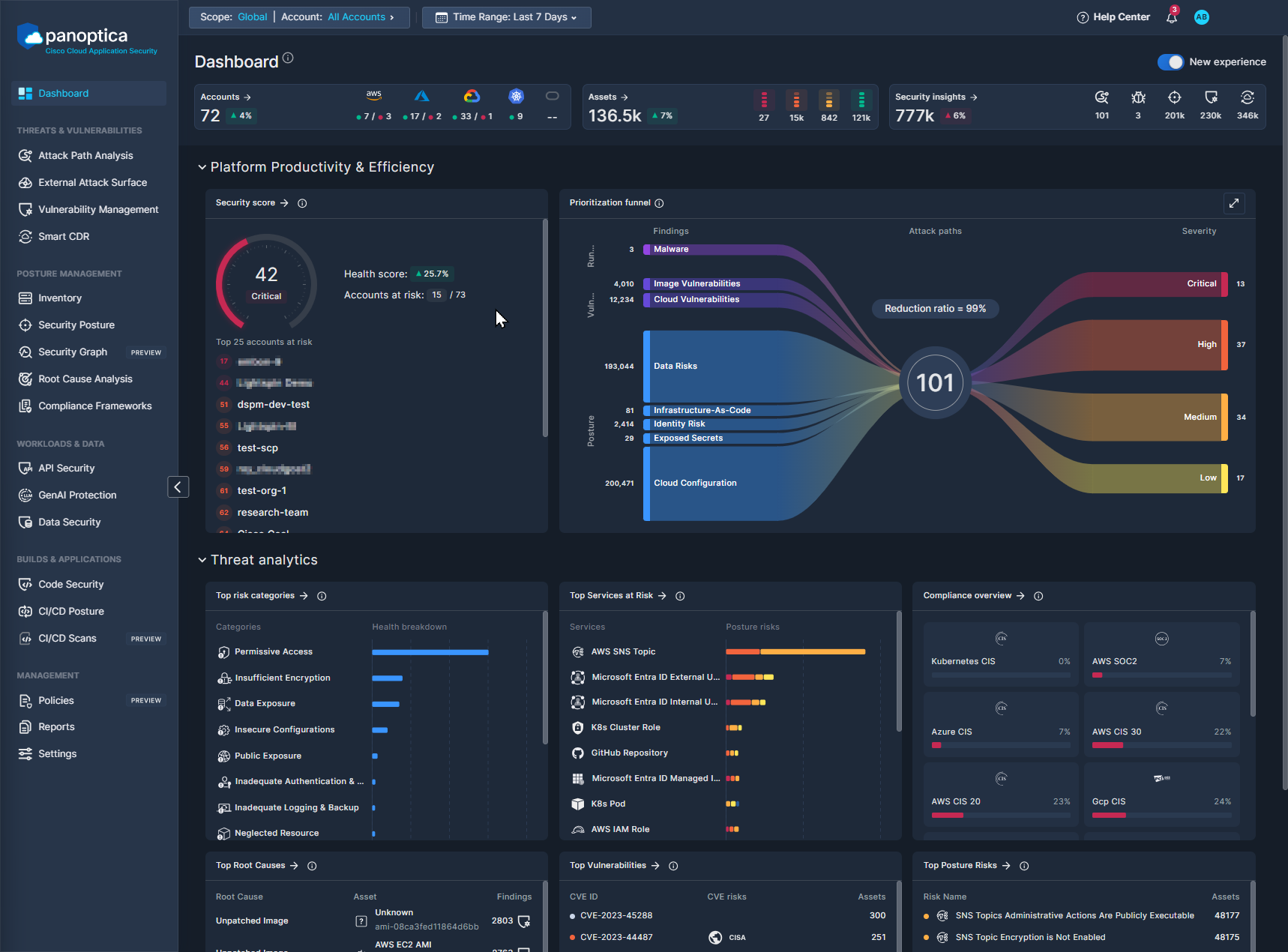
Accounts
The Accounts widget displays a snapshot view of the active accounts and clusters integrated with Panoptica.
- Click Accounts to jump to the Accounts table, where you can manage the cloud accounts and Kubernetes clusters you have onboarded.
- The Trend icon beside the total number of accounts indicates the change in active accounts during the selected time frame.
- Hover over the icon for each cloud provider to see how many of the connected accounts have been scanned successfully, and how many have not.
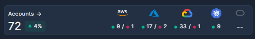
Assets
The Assets widget displays a summary of all the assets in your cloud inventory, broken down by health level.
- Click Assets to jump to the Asset Inventory page, where you can delve deeper into all the assets Panoptica has discovered in your onboarded resources in a single, consolidated platform.
- The Trend icon beside the total indicates the change in the number of assets during the selected time frame.
- Hover over each health level to see the breakdown by health level: Critical, Bad, Moderate, Good
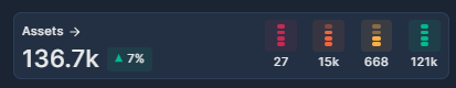
Security Insights
The Security Insights widget provides a snapshot view of the risks Panoptica has identified in your environment, broken down by module.
- Click Security Insights to jump to the Security Posture page, where you can delve deeper into security issues and vulnerabilities that could be putting your cloud resources at risk.
- The Trend icon beside the total indicates the change in the number of risks identified during the selected time frame.
- Hover over each icon to discover which Panoptica module it represents. The number under each icon indicates the number of risks discovered by that engine. Click the icons to jump to the relevant page in the Panoptica console, where you can delve deeper into the data and insights Panoptica can provide.
- Click Attack Paths to jump to the Attack Path Analysis page.
- Click Malwares to jump to the Security Posture page, pre-filtered for Malware.
- Click Posture Findings to jump to the Security Posture page.
- Click Vulnerabilities to jump to the Vulnerability Management page.
- Click CDR Threats to jump to the Smart CDR page.
Platform Productivity & Efficiency
Security Score
The Security Score widget displays the overall health score of your cloud environment, and up to 25 accounts deemed most at risk.
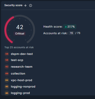
- The health score is aggregated from the health scores of each asset in your environment. It represents the overall security status of the tenant, from 0–100. See Asset Health Score for details.
- The Trend icon indicates the percentage change in the tenant health score during the selected time frame.
- Below the security score is a list of the active accounts with the most critical health scores. Click any account name to create a quick-filter for that account in the Asset Inventory page.
Prioritization Funnel
The Sankey diagram provides an intuitive view of Panoptica's cloud security solution. Flowing left-to-right, the funnel reduces the noise from thousands of security findings into prioritized attack paths. By distilling all your risks and vulnerabilities into a manageable list, the Prioritization Funnel enables you to take action on the most severe issues first.
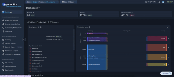
The left side of the Sankey diagram displays the findings from Panoptica's various risk engines, broken down by topic. Click any of the threads to pivot to the corresponding Panoptica module with a pre-filtered view of the relevant findings: Vulnerability Management, Security Posture, etc.
The right side of the Sankey diagram displays the attack paths that Panoptica has identified in your environment, broken down by severity.
Hover over the total number of attack paths at the center of the Sankey diagram to see a list of attack path categories. Click on any of the categories to pivot to the Attack Path screen, pre-filtered for the category you selected.
Threat analytics
The widgets that comprise the Threat Analytics section on Panoptica's new Dashboard provide visibility into the key security issues in your environment. By helping you visualize the categories and services at risk, the vulnerabilities and root causes behind those risks, and your compliance status, Panoptica helps you identify weaknesses in your organization's security and where it can be improved.
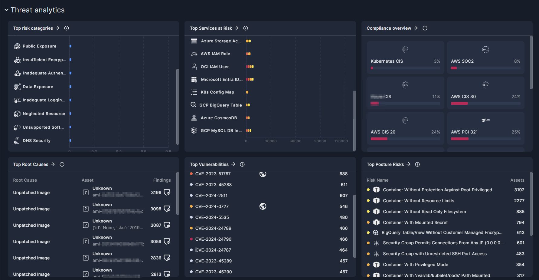
Top Risk Categories
The risks that Panoptica detects in your environment are grouped into a number of Risk Categories. This widget sorts the categories according to the number of risks in each category, to help you visualize the most prevalent risks.
- Hover over the bar chart to see the number of risks in each category.
- Click any row in the list to pivot to the Security Posture screen, pre-filtered for the category you selected.
Top Services at Risk
Panoptica is able to identify dozens of different Services in your cloud accounts and Kubernetes clusters. This widget lists the services most at risk.
- Hover over the bar chart to see a breakdown of the risks by severity.
- Click any row in the list to pivot to the Asset Inventory screen, pre-filtered for the service you selected.
Compliance Overview
Panoptica provides the tools you need to ensure your cloud stack aligns with a number of key compliance requirements. This widget displays how your resources are scoring against the major compliance framework such as HIPAA, GDRP, and more.
- Click any of the panes in the widget to pivot to the Compliance Framework screen, pre-filtered for the framework you selected.
Top Root Causes
Panoptica can help identify the underlying root cause of attack paths, security issues, and vulnerabilities in your environment, enabling you to effectively address multiple security gaps in a single action. This widget lists the most prevalent root causes, sorted by the number of security findings associated with each one.
- To view remediation options for each category, click any row in the list to pivot to the Root Cause Analysis screen, pre-filtered for the category you selected.
Top Vulnerabilities
This widget displays the most prevalent CVE IDs found in your environment, sorted by the number of assets infected by each vulnerability.
- Hover over the icons in the CVE Risks column to discover the category of risk associated with each CVE.
- Click any CVE ID in the list to pivot to the Vulnerability Management screen, pre-filtered for the vulnerability you selected.
Top Posture Risks
Panoptica is able to identify hundreds of Risks in your cloud accounts and Kubernetes clusters. This widget lists the most prevalent risks, sorted by the number of assets affected by each risk.
- Click any risk name to pivot to the Security Posture screen, pre-filtered for the risk you selected.
Updated 9 months ago